

Infographic Design
Duration: Two weeks (February 2018) | Role: Infographic Designer
Motivation
“Data visualizations allow people to readily explore and communicate knowledge drawn from data.”
Problem
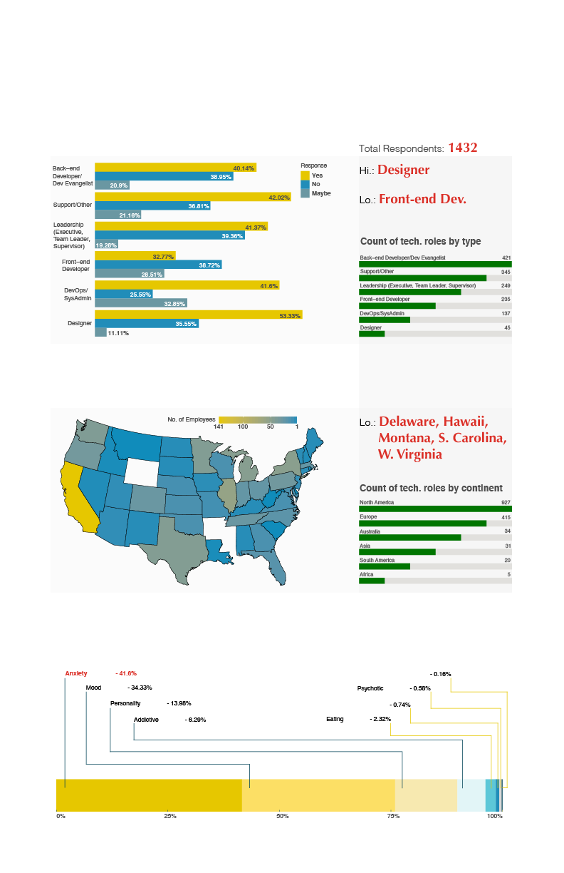
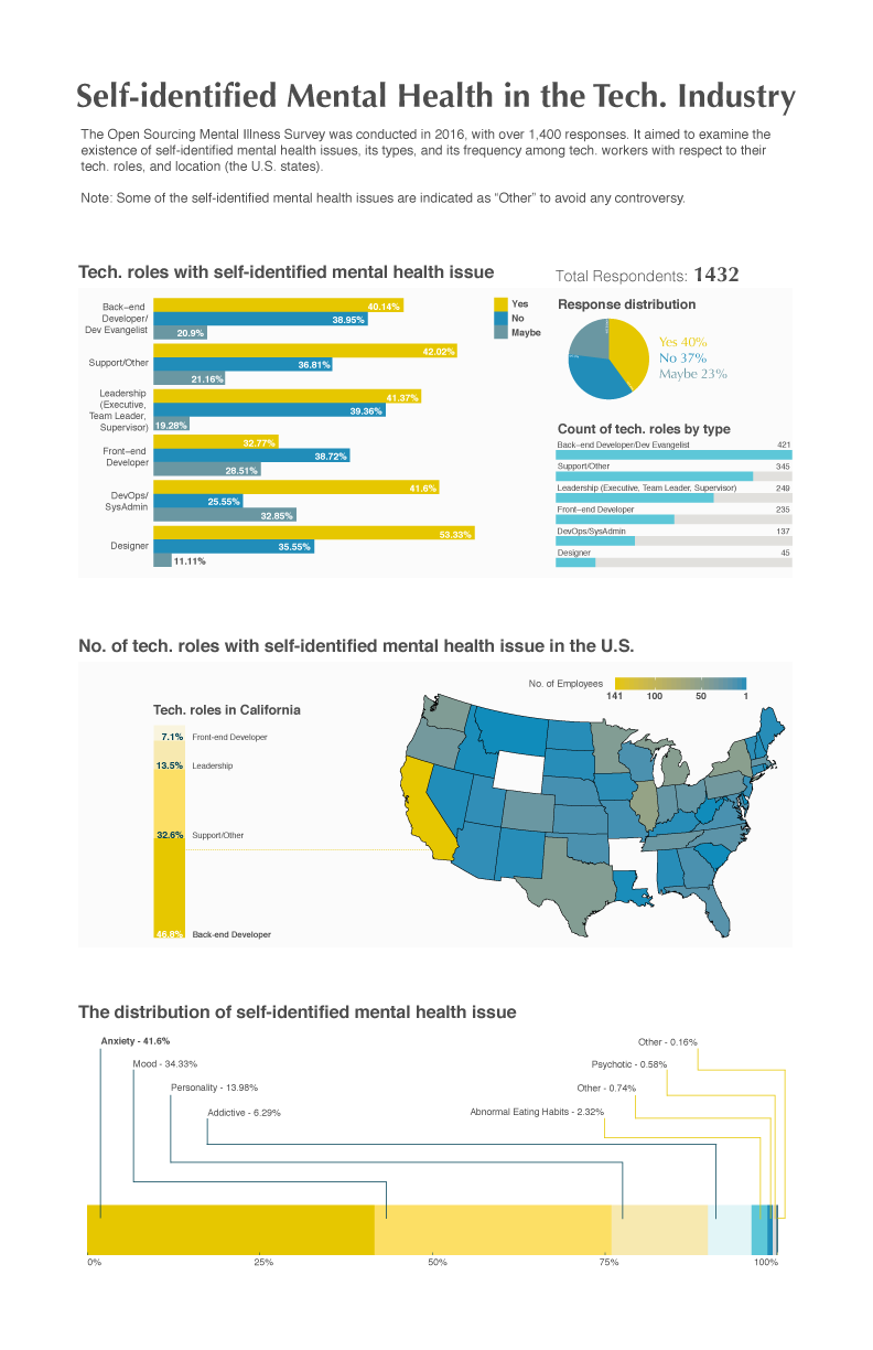
The Open Sourcing Mental Health Survey was conducted in 2016. With over 1,400 responses, it aimed to examine the frequency of self-identified ‘mental health issues’ among tech workers by various responses (i.e. gender, occupation, location, company, etc). See dataset
For our infographic design, we were in search of the answers to the following research questions:
How many survey respondents with a tech role currently claimed to have a mental health issue?
Which US state has the most tech workers who identify a mental health issue?
What types of tech roles had the most self-identified mental health issue?
What type of mental health issues do tech employees self-identify?
Our challenge was to visualize the answers from 1,432 records in the data-set.
Constraints
Output should be in a standard print size document (PDF) 11 x 17 ".
Our Approach
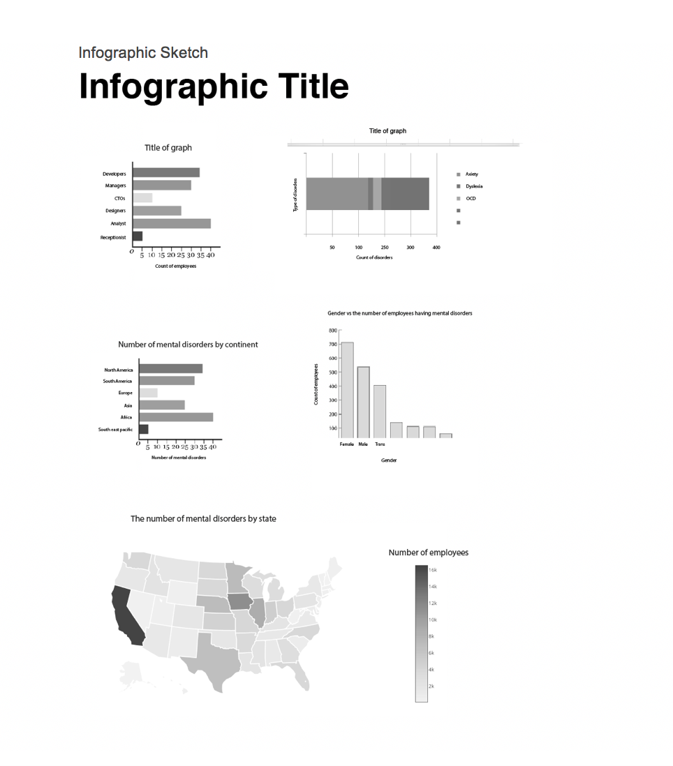
Our infographic design proposal initiated with the following digital sketch:
research
We proposed to incorporate Stephen Few's taxonomy for plotting graphs:
Classification of multiple distribution: Counts of values per interval from lowest to highest, for example, a bar graph is designed to display “Count of tech. roles by type”.
Part-to-whole: Values represent parts of a whole, for example, a pie chart its designed to display “Response distribution” , a stacked bar graph is designed to display “Tech. roles in California” and “The distribution of self-identified mental health issue”.
Nominal comparison: A simple comparison of values for a set of unordered items, for example, a bar graph is designed to display “Tech. roles with self-identified mental health issue”.
Geospatial: Values are displayed on a map to show their location, for example, the U.S. map represents “No. of tech roles with self-identified mental health issue in the U.S.”
design
Our design goal was to craft a visual display:
• To help readers answer a particular question about the survey.
• To draw in the readers and ease them through the display, helping them notice first what’s important and then make all the appropriate distinctions.
• To communicate effectively by helping readers understand at a glance and later recall without effort.
We upheld Kosslyn's three goals for graph design:
Connecting with the audience: Graphs and other displays serve to help readers answer a particular question. Therefore, we came up with 4 research questions to begin with.
Direct and hold attention: A good display helps readers notice first what’s important and then make all the appropriate distinctions. For example, our eyes are drawn to the highest contrasting elements or to the most visually striking aspects of a display relatively. Therefore, the header fonts are bold compared to other fonts to denote its importance.
Promote understanding and memory - The principle of informative changes: The reader will interpret any change in the appearance of a display as conveying information. Therefore, the complementary colors used in the graphs denote the change in the data.
Applied color theory & visual design principles:
Layout: In general, wider margins help focus the eye and create a sense of calm or stability. Narrow lateral margins increase tension because the live matter is in closer proximity to the format edge.
Color: When you are pairing colors, you can find harmony through choosing complementary colors. Therefore, the color scheme we chose suits well to denote informative changes in the graphs. Additionally, it provides enough contrast for color blind users to discern changes.
Visual:
Visual hierarchy: It guides the eye on the page so that it attends to different design elements in the order of their importance through a variety of signals , such as, scale, spacing, placement.
Scale: Use of relative size to signal importance and ranking in composition. For example, the font size used in the output controls the delivery of the experience in order.
Contrast: Provides the eye with a noticeable difference between two objects.
Gestalt law of similarity: The human eye tends to build a relationship between similar elements within a design. For example, the complementary colors are shared across all the graphs in the first two regions with only one legend. Because the readers will build the relationship across all the graphs in the first two regions due to the similarity achieved using complementary colors.
Gestalt law of common region and proximity: Natural groupings of the visual elements to form a sense of relatedness.
Output
Tools Required
R graphics (R Studio), Adobe Illustrator, and Microsoft Excel, Sim Daltonism Color Blind Simulator.
Contribution
This project was a two-person based team effort:
Carolyn Rojsutivat (Researcher & Writer) - Carolyn executed all the research activities, including, identifying (variables) & cleaning of the data set (using Microsoft Excel), Few's classification for plotting graphs, and writing analysis report.
Abhinit Parelkar (Designer) - I executed all the design activities, including, R-programming (plotting of the graphs), testing complementary colors (using Sim Daltonism), designing 17 iterations of infographic (using Adobe Illustrator), following Kosslyn's three goals for effective graph design, and visual design principles.
Lessons Learned
The project was in itself unique. The ability to make a design decision along with a researcher was an exhilarating experience. I learned valuable lessons and would love to improve further.
My key takeaways were:
UX copywriting plays a key role in design. It has the power to change the perspective of final product.
We learnt that adding a story gives user a context about what the infographic is trying to convey.